DV2008
Interface Design Portfolio
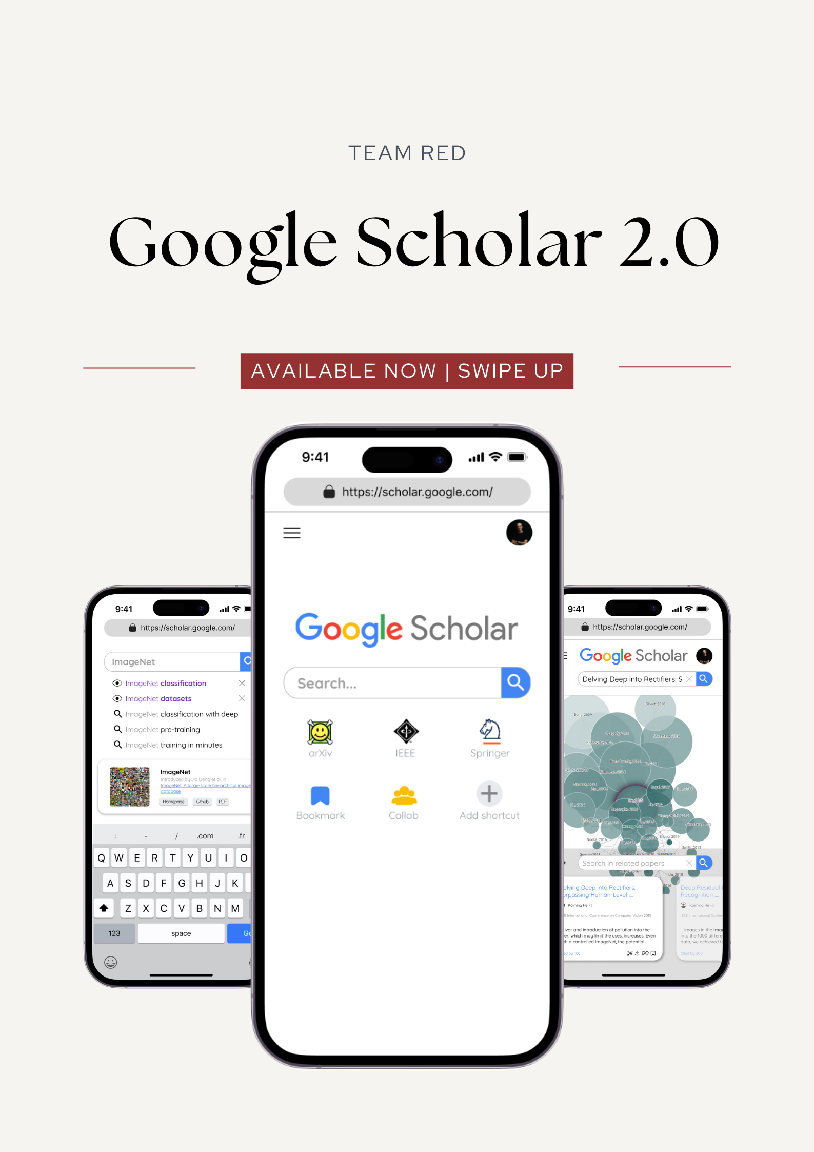
From Frustration to Satisfaction:
Empowering STEM undergraduates to accurately and efficiently access scholarly literature.
TIMELINE: Jan - Apr 2023
PROJECT CATEGORY: UI/UX project
PLATFORM: Mobile (iOS)
COLLABORATORS: Xinying (Me), Rachel, Fuguo, Sebastian, Limin
BACKGROUND
This project focuses on enhancing the UI/UX design of the Google Scholar iOS mobile web version.
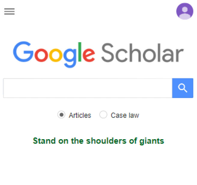
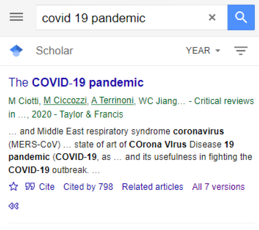
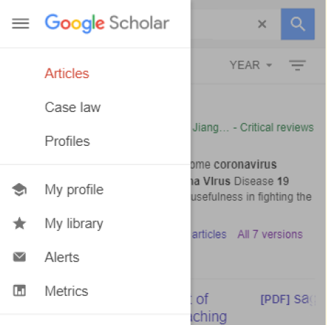
Google Scholar, a free web search engine launched in 2004, provides easy and accurate access to scholarly literature across various formats and disciplines. Key features include:
📕Access to literature with links
🗝️Citation analysis tools
📝Related articles suggestions
🔢Extensive legal database of US cases
MY ROLE
What I did in this project.
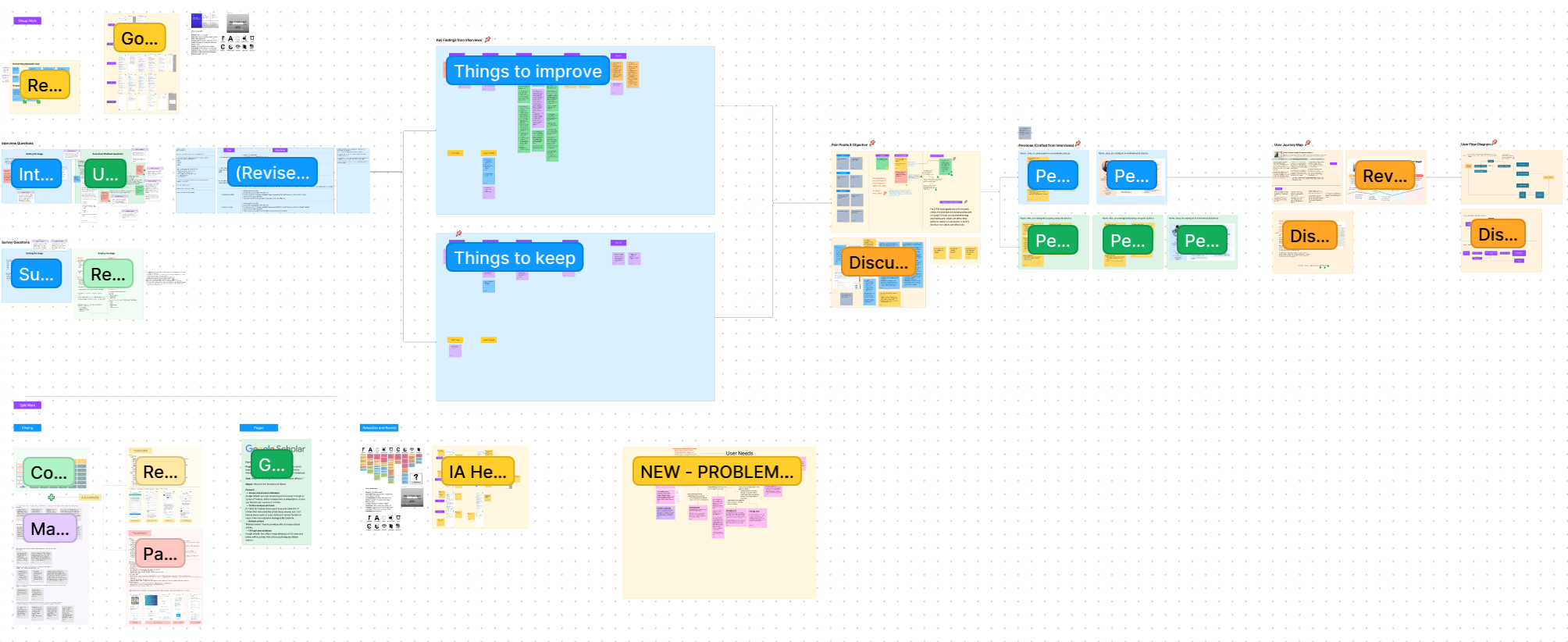
🎯Establish clear research objectives and targets
🎓Strategize well-crafted research methodologies
🖍️Extract guiding principles for design
📱Construct engaging wireframes and innovative prototypes
⛳Refine by incorporating valuable findings from user testing
SECTION I - USER & MARKET RESEARCH
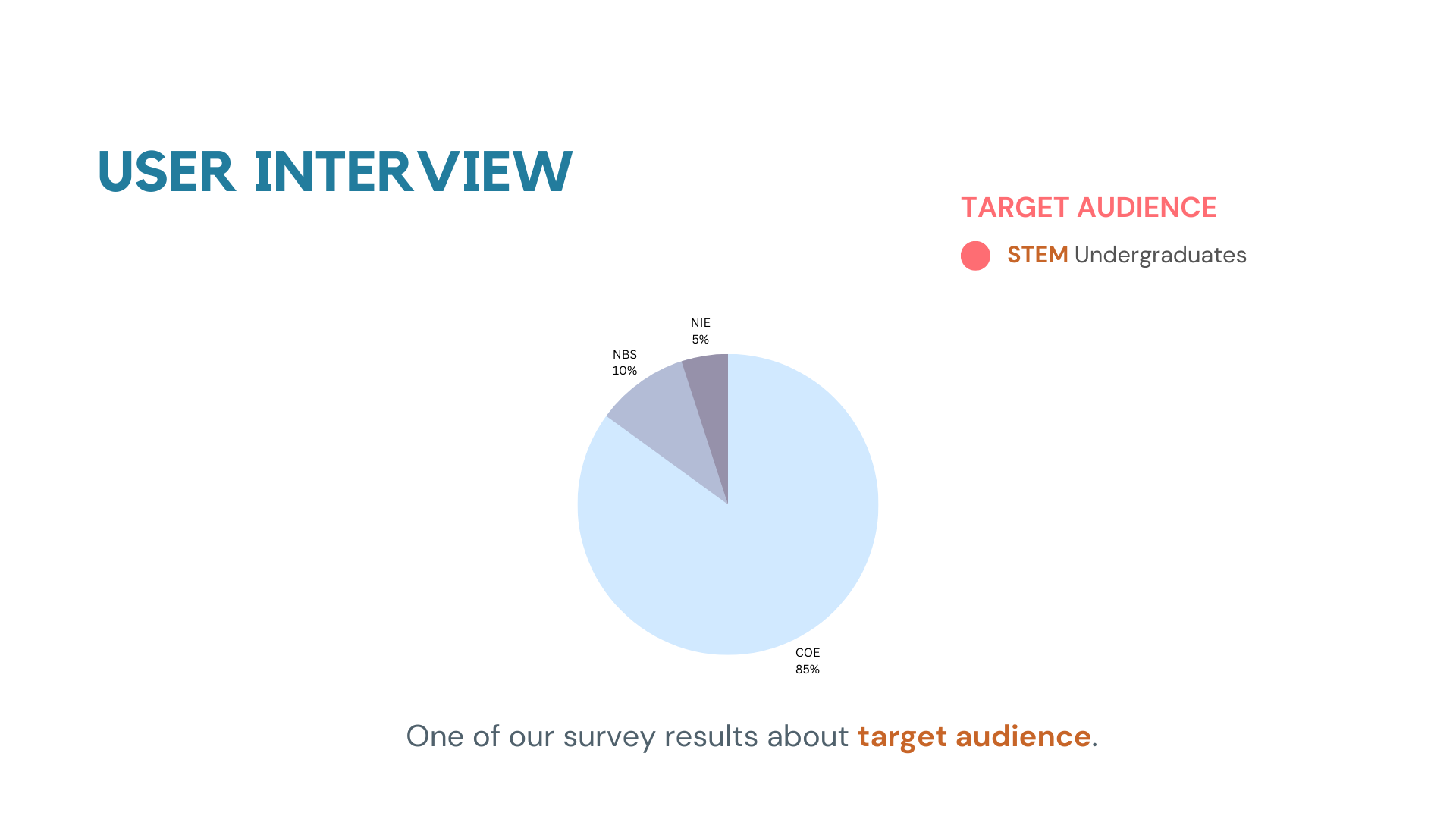
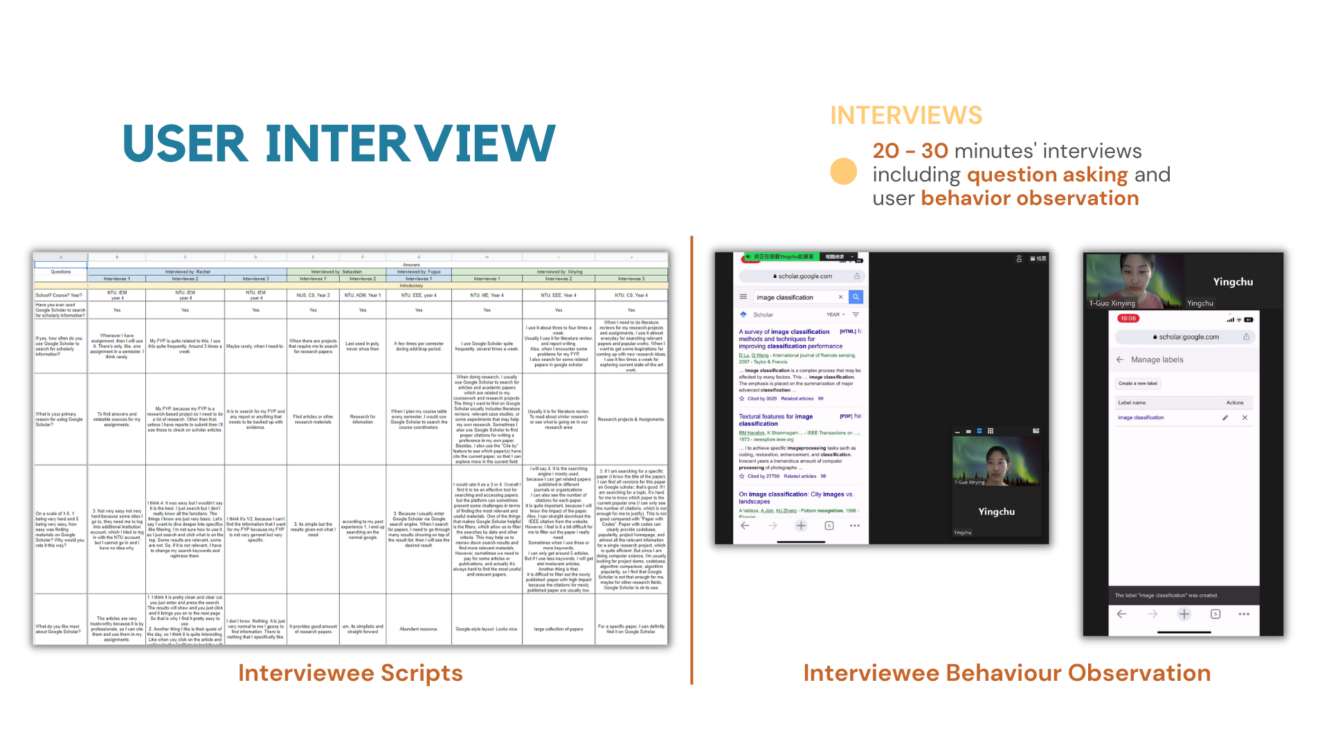
Define target audience & Understand needs and pain points.
KEY INSIGHTS
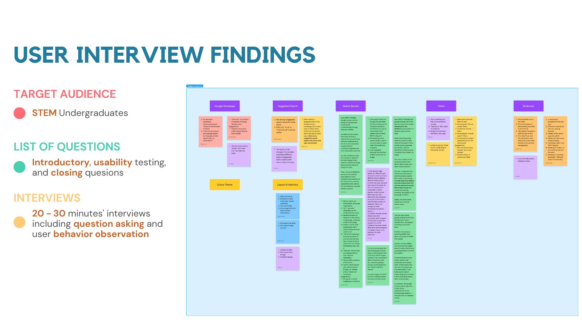
Based on our survey, we have the following key insights.
⭐Pain points: 3 able
1️⃣Reliable: Users find it hard to identify if the article is reliable
2️⃣Relatable: Users often get unrelated searches
3️⃣Locatable: Users find it hard to effectively locate the articles they want
PROBLEM STATEMENT
The main problem we want to solve.
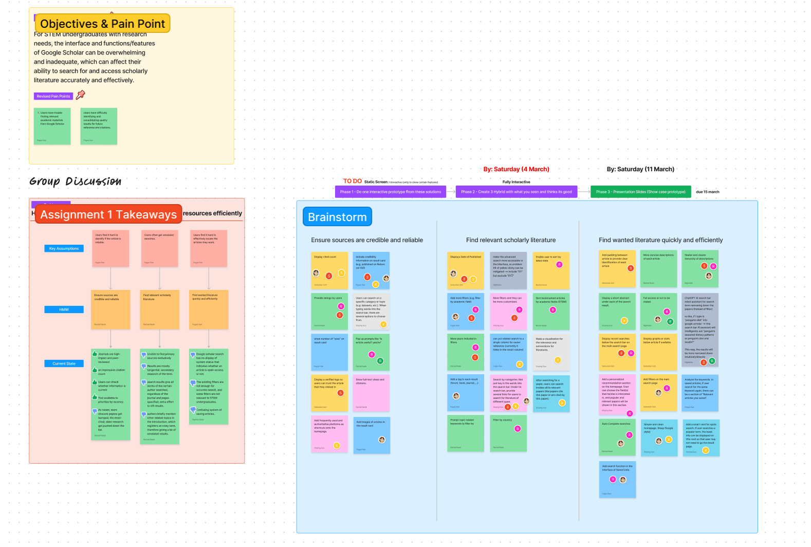
🌟For STEM undergraduates with research needs, the interface and functions of Google Scholar can be overwhelming and inadequate, which can affect their ability to search for and access scholarly literature accurately and effectively.
BRAINSTORMING FOR BUSINESS OPPORTUNITIES
Access the specific pain points and offer tailored solutions.
👑Enhanced Functionality: Introduce additional functions and features that cater specifically to STEM undergraduates' research needs, such as subject-specific filters, advanced search capabilities, and personalized recommendations to ensure more accurate and relevant search results.
📖Educational Resources: Provide integrated educational resources, such as tutorial videos or guided search tips, to help STEM undergraduates better understand the research process, enhance their search skills, and make the most of Google Scholar's features.
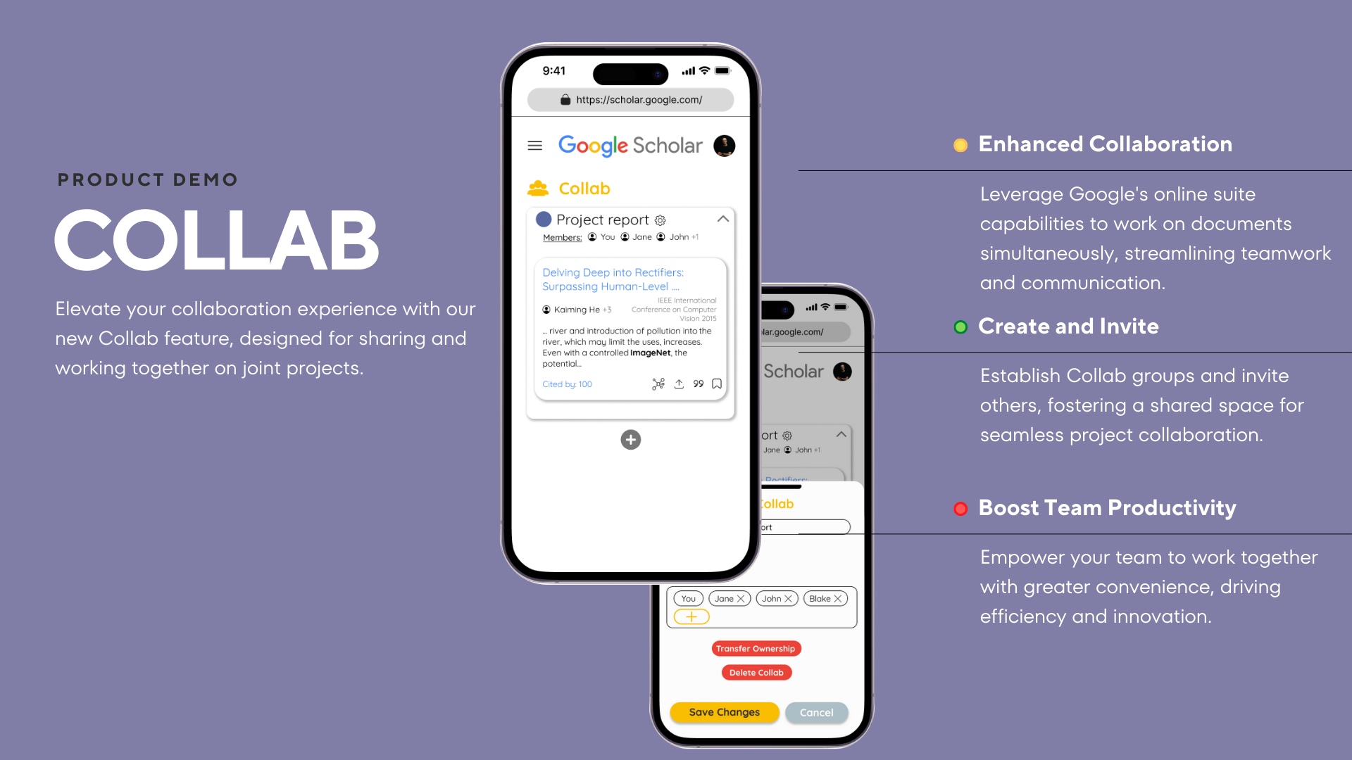
👥Collaboration Tools: Offer collaboration features that enable STEM undergraduates to share and discuss research findings with peers or mentors, fostering a sense of community and promoting knowledge exchange.
🤳🏿Mobile App Development: Create a dedicated mobile app for STEM undergraduates that delivers a seamless, on-the-go research experience, enabling them to access Google Scholar's features and resources anytime, anywhere.
PROJECT GOAL & HOW MIGHT WE?
An intuitive interface for precise, efficient access to scholarly literature.
1️⃣Reliable: HMW ensure sources are credible and reliable?
2️⃣Relatable: HMW find relevant scholarly literature?
3️⃣Locatable: HMW find wanted literature quickly and efficiently?
SECTION II - PROTOTYPES
Our THREE preliminary prototypes.
PROTOTYPE A - Intuitive Search & Save
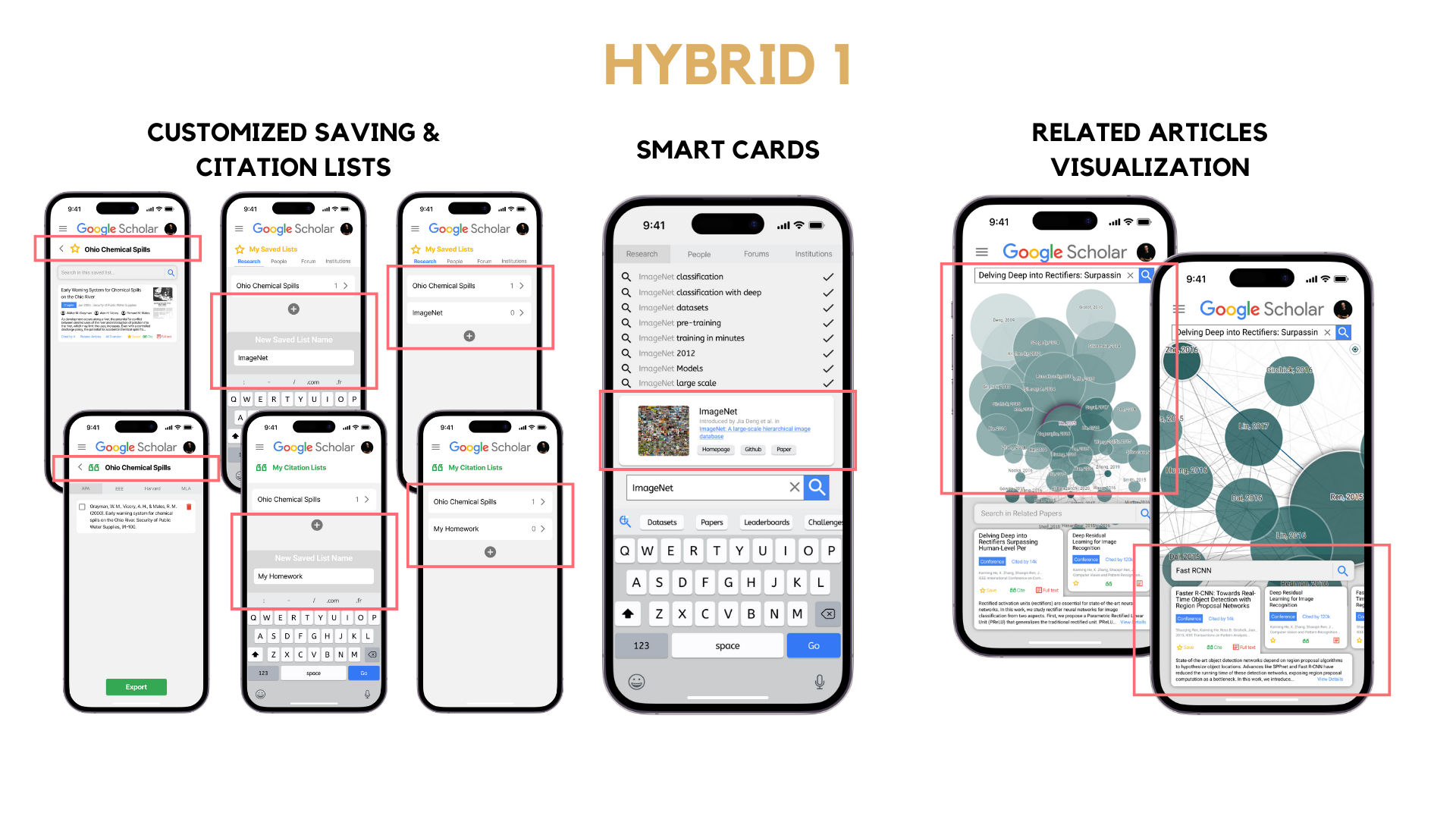
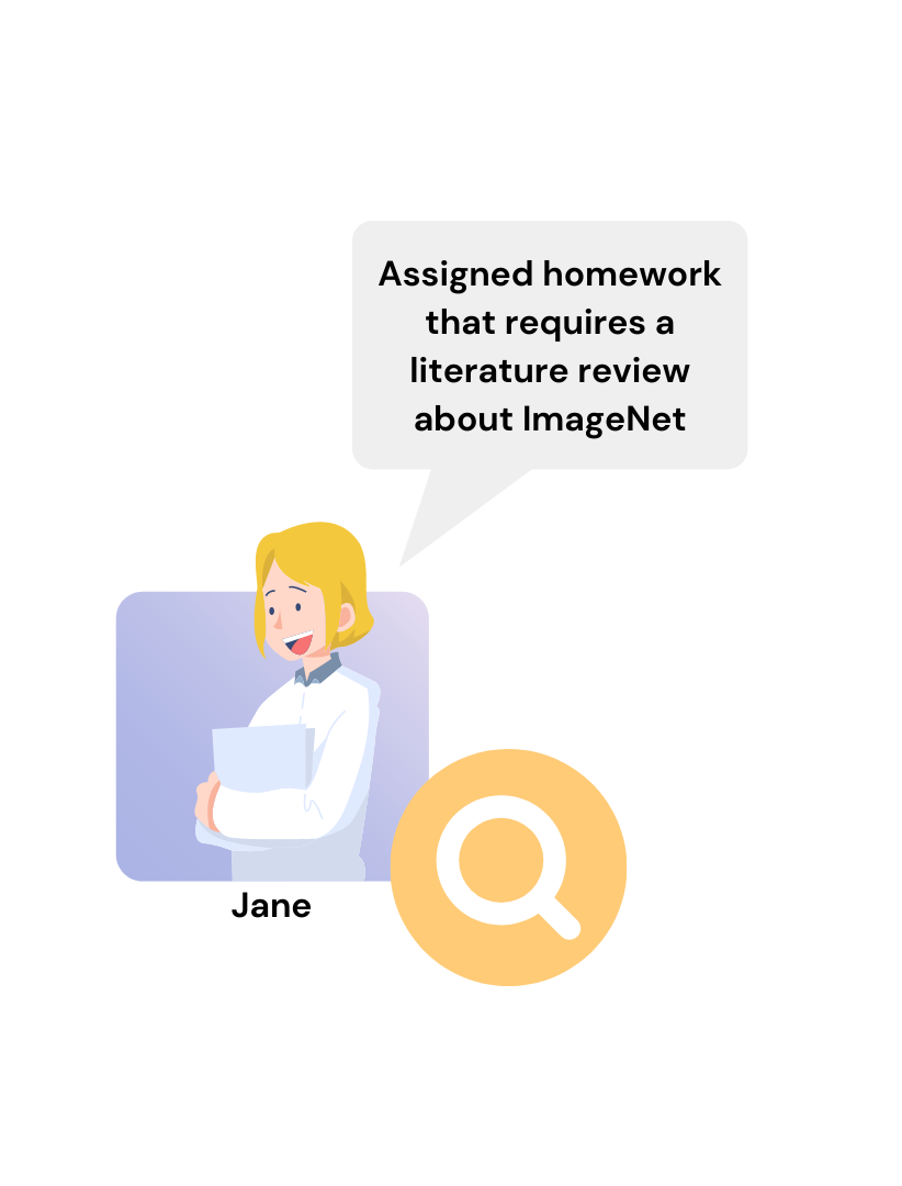
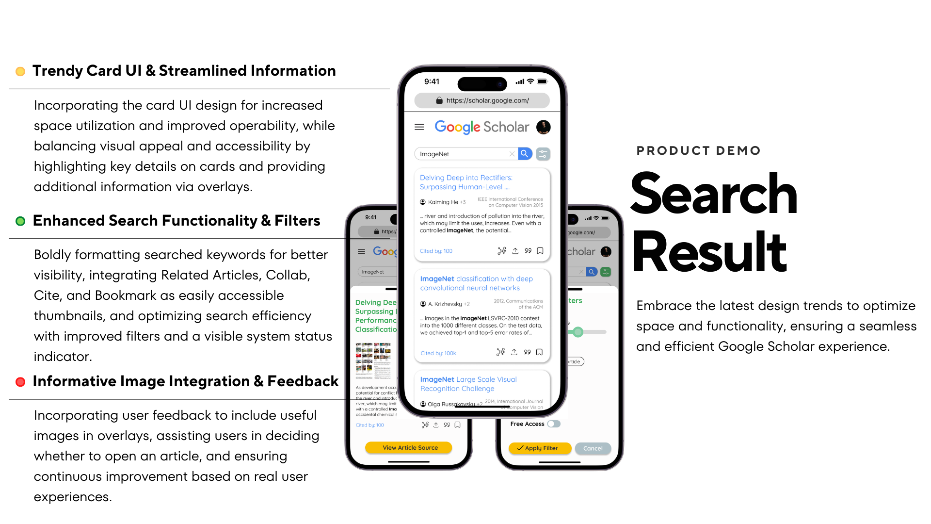
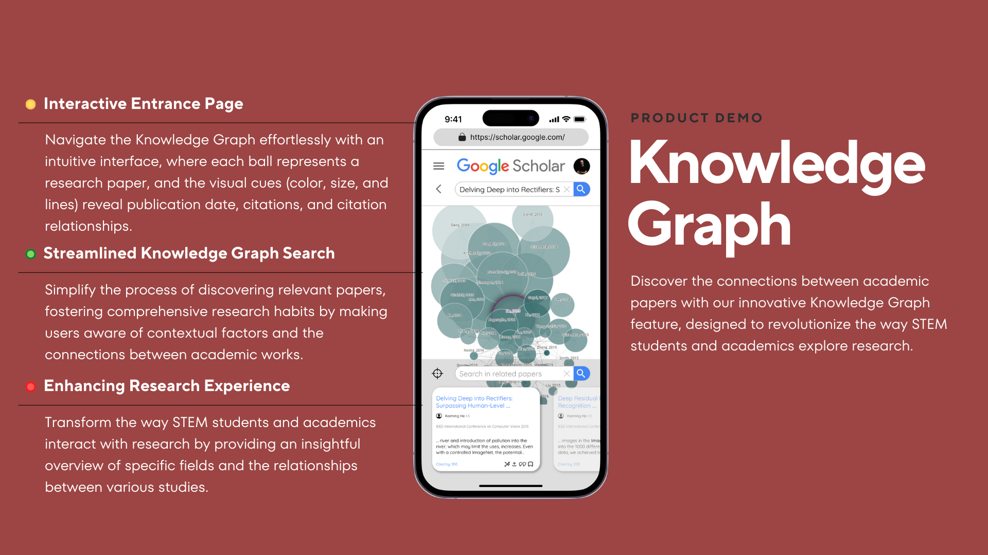
Discover a seamless and efficient experience for searching and saving literature with our first prototype. Combining Fuguo's customizable bookmarks and Xinying's smart cards and knowledge graphs, this design streamlines the research process for STEM students like Jane, who can quickly find, understand, and organize the most relevant articles for her projects.
PROTOTYPE B - Personalized Scholar
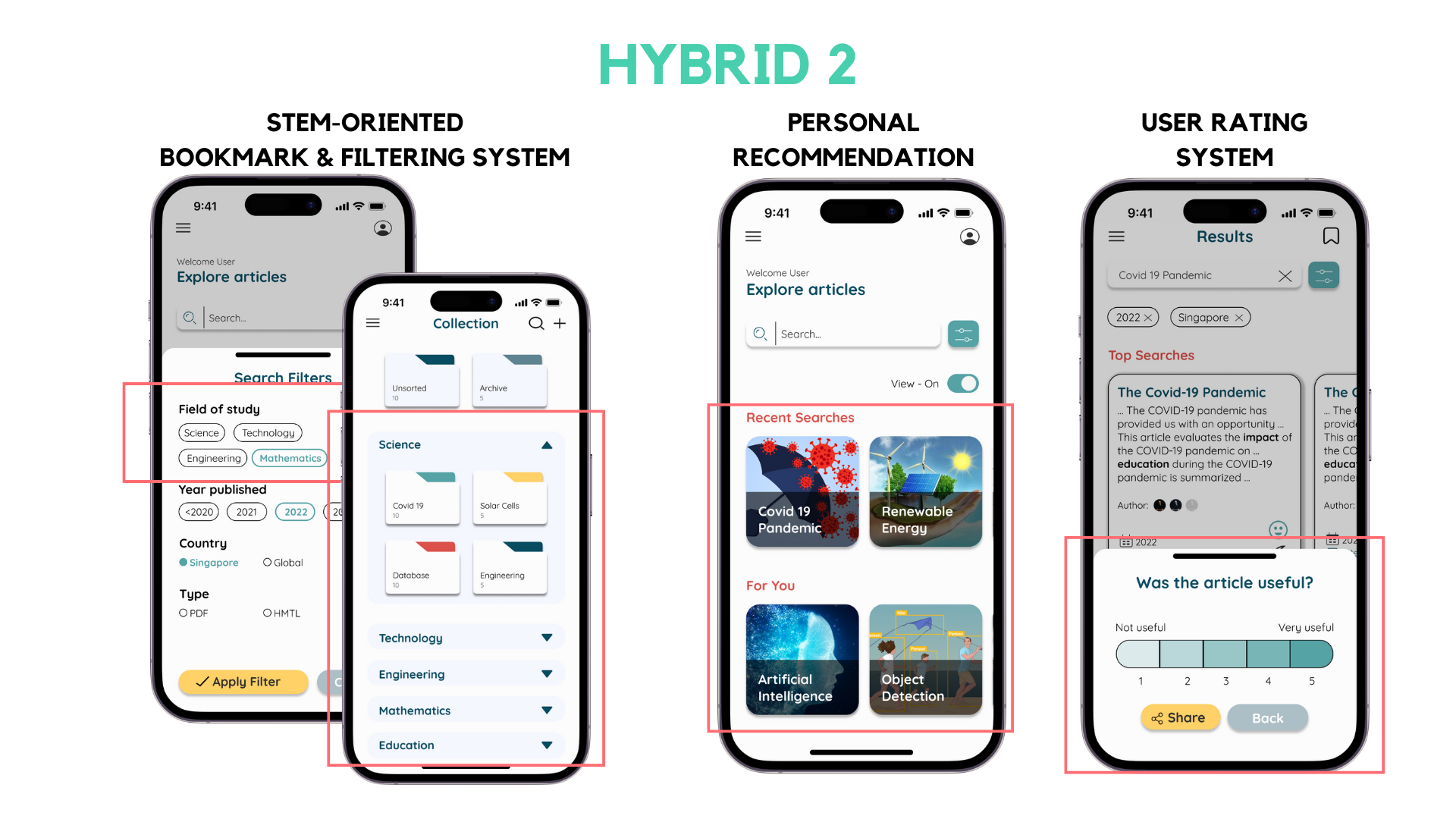
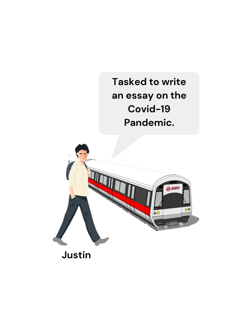
Our second prototype, inspired by Rachel's design, offers a STEM-oriented bookmark and filtering system, personalized recommendations, and a user rating system to enhance the credibility of search results. Stay up-to-date with the latest developments in your field and efficiently organize your literature, just like Justin, who used these features to write an essay on the COVID-19 pandemic.
PROTOTYPE C - Collaborative Explorer
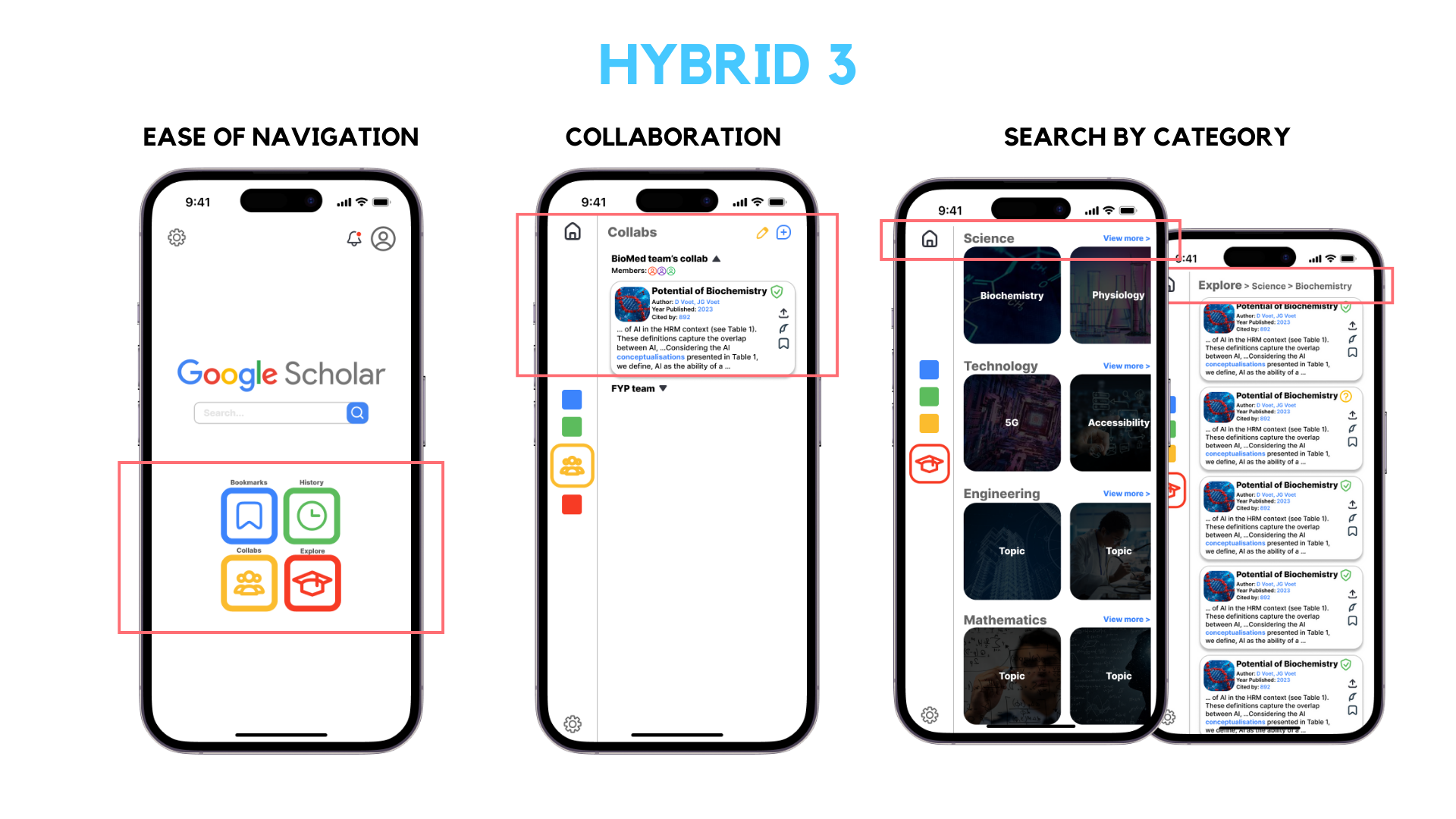
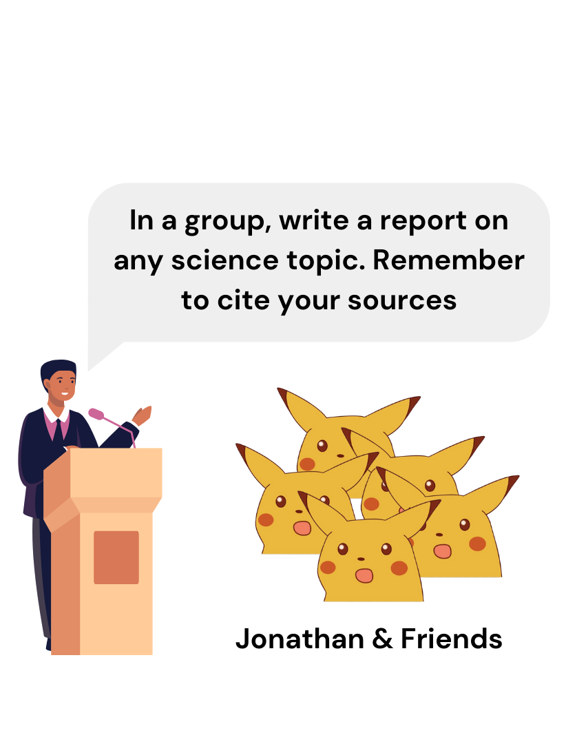
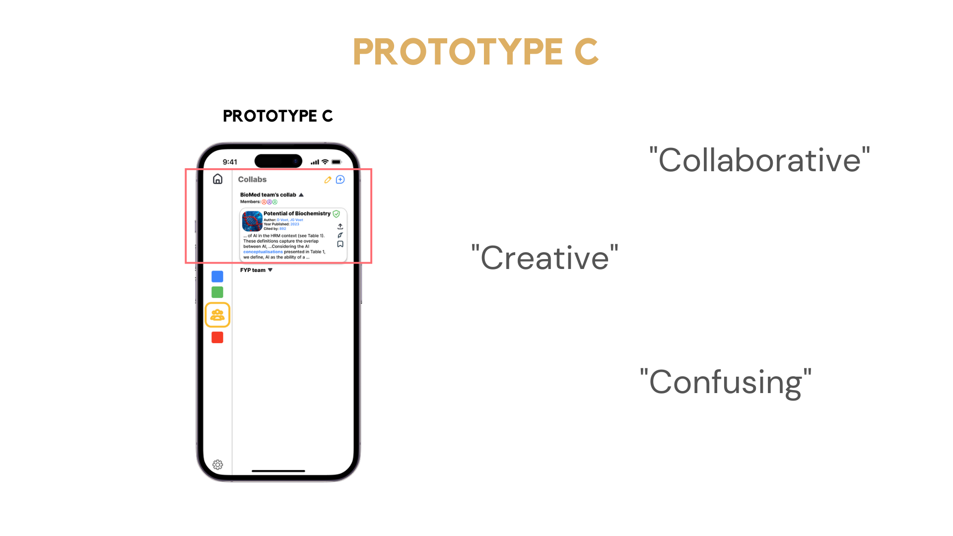
The third hybrid prototype, based on Sebastian's design, focuses on improving communication and collaboration between users. With features like the Google Scholar Collab and the "Explore" category search, this prototype enables users like Jonathan and his group mates to efficiently find literature, share bookmarks, and work together on their science report.
SECTION III - USABILITY TESTING
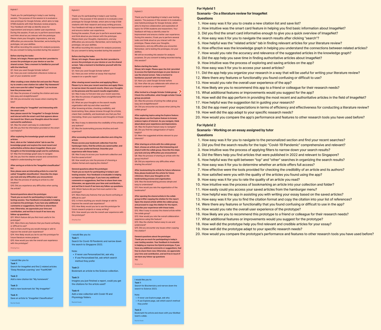
We conducted usability testings on the THREE prototypes.
TESTING METHODS
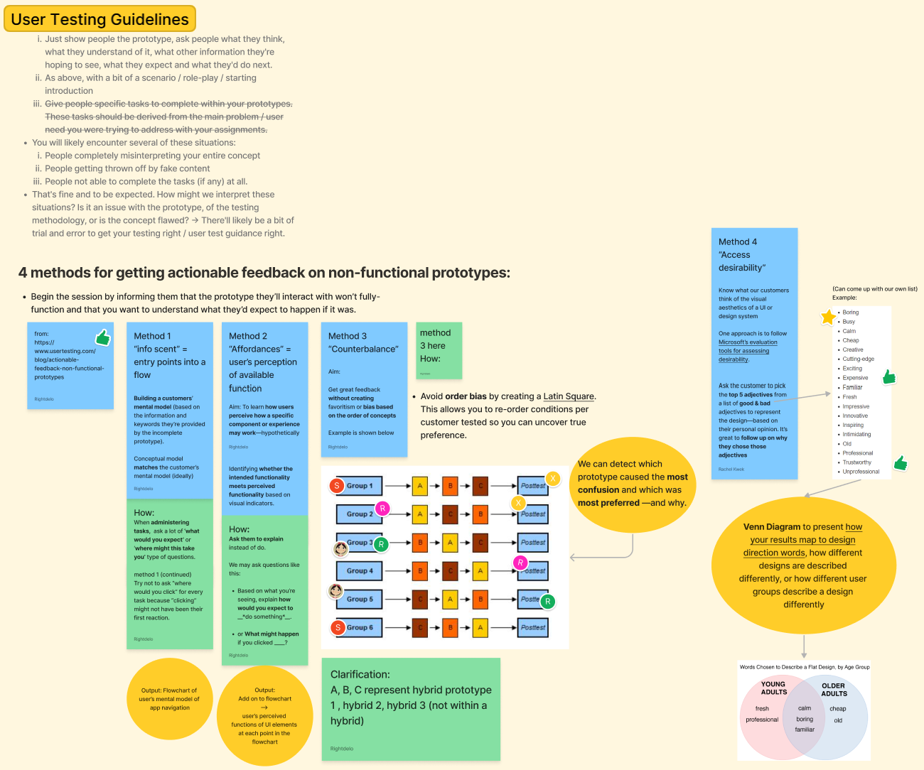
During our usability testing, we made use of counterbalance measures design by showing different interviewees the 3 prototypes in different orders. This helped to uncover their true preference and getting their unbiased view.
OVERALL RESULTS
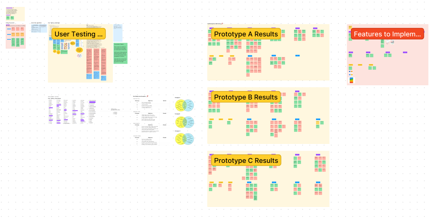
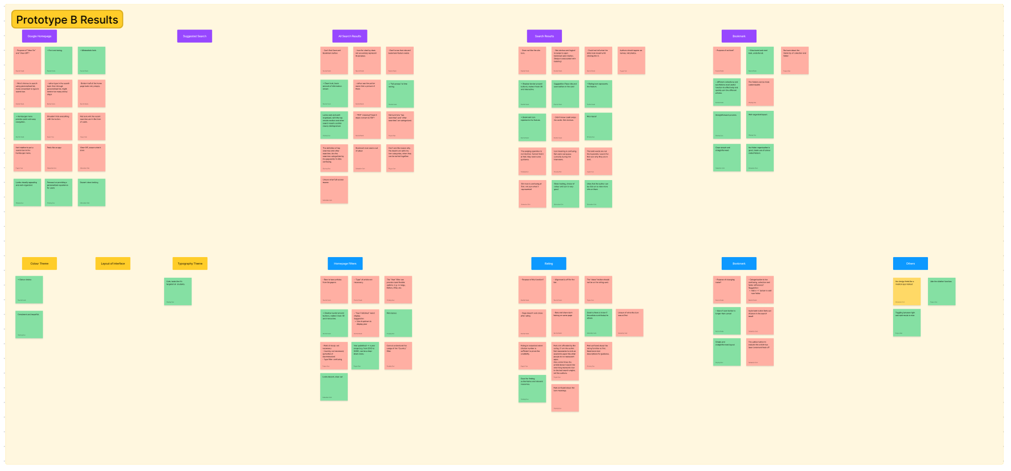
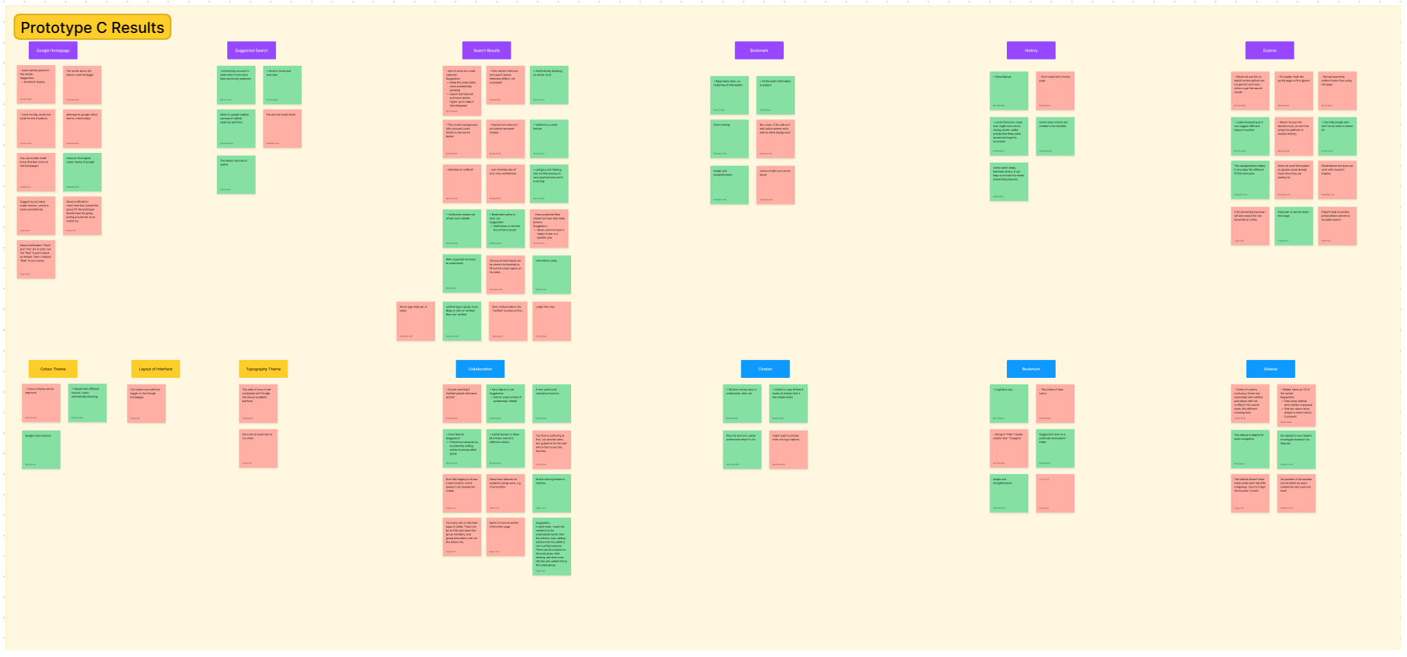
Here are the pros and cons users mentioned during the interview.
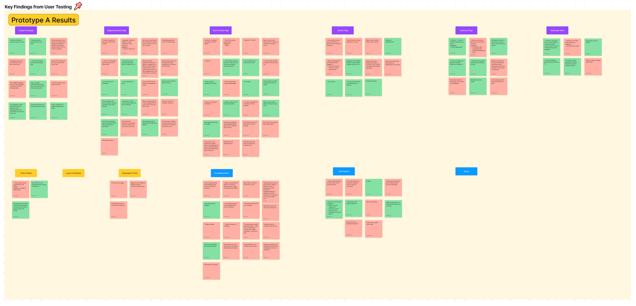
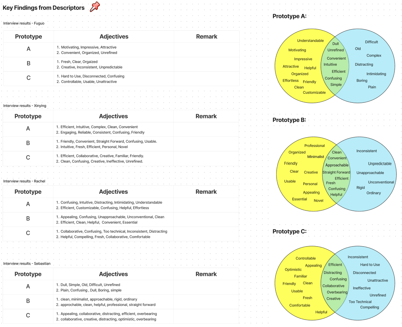
Here are our conclusive insights.
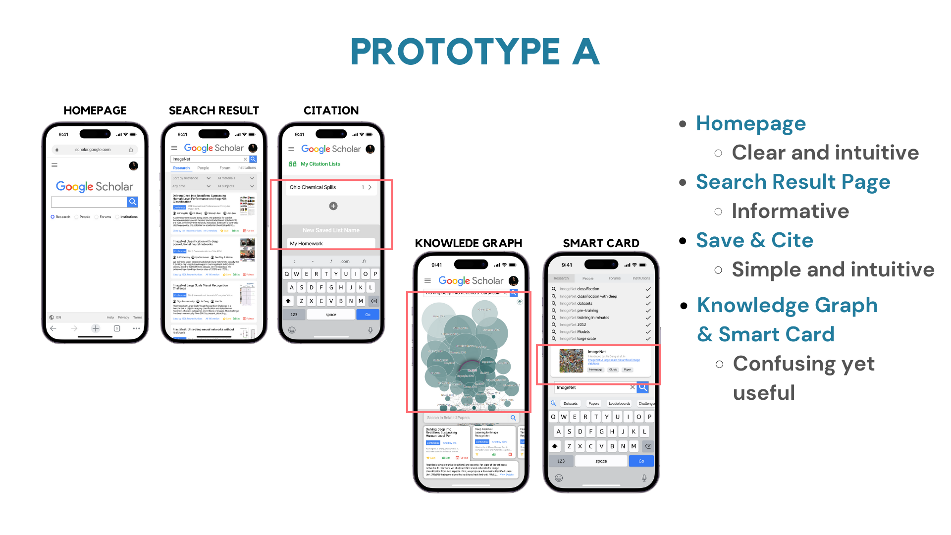
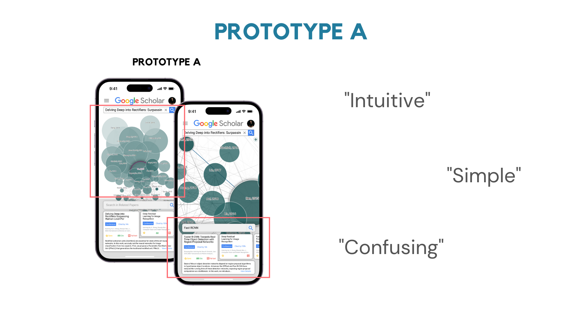
PROTOTYPE A: Streamlined Literature Search with Room for Clarity
Prototype A simplifies literature search and organization. However, some users found knowledge graphs and smart cards confusing. Overall, users appreciated its intuitiveness and efficiency, despite a need for clarification on certain features.
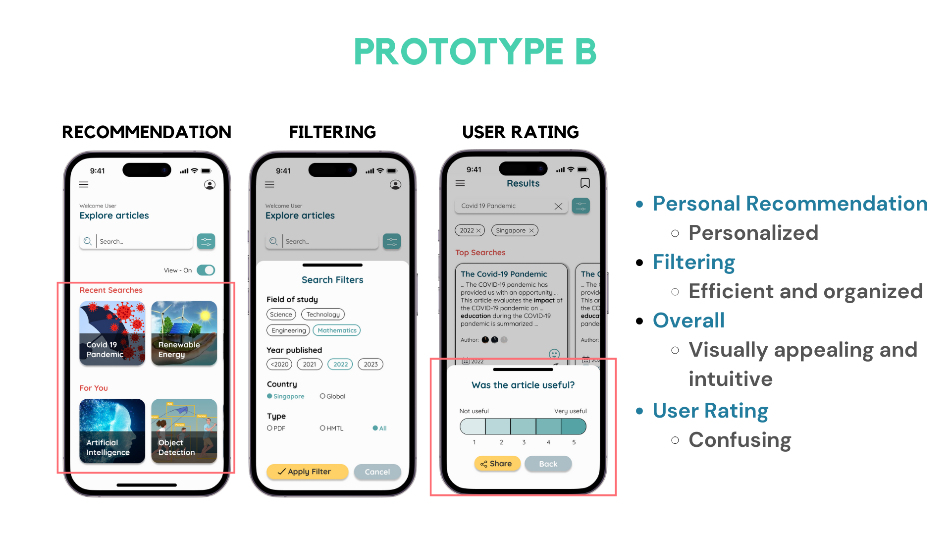
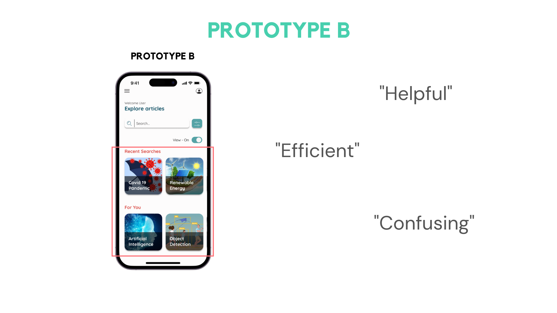
Prototype B: Personalized Research Hub with Confusing Rating System
Prototype B offers advanced filtering and personalized recommendations, but users found the rating process confusing. Despite this drawback, users enjoyed the helpful and organized experience it provided.
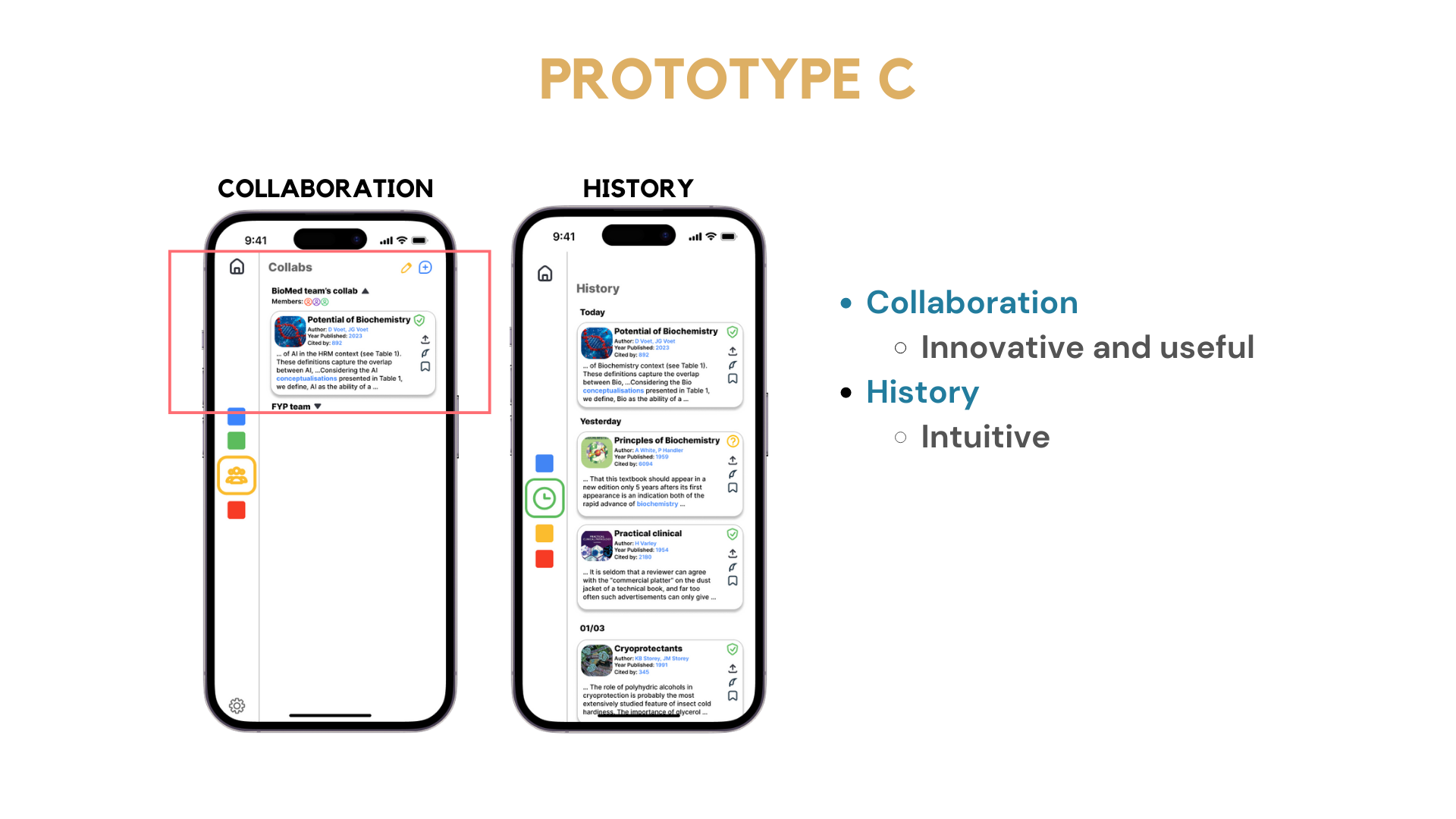
Prototype C: Collaborative Research Tool with Confusing New Features
Prototype C enhances collaboration through article sharing and group forming. Users valued its innovation and ability to facilitate teamwork but found some new features confusing, highlighting a need for improvement in usability.
SECTION IV - FINAL PROTOTYPES
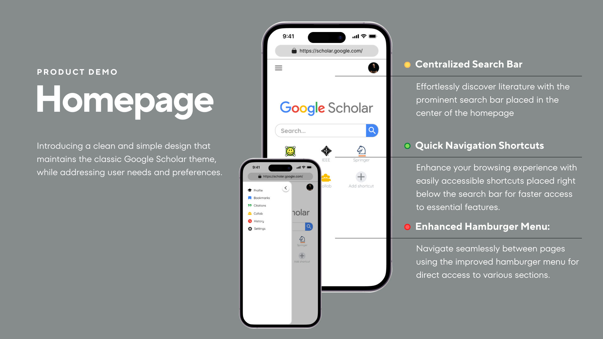
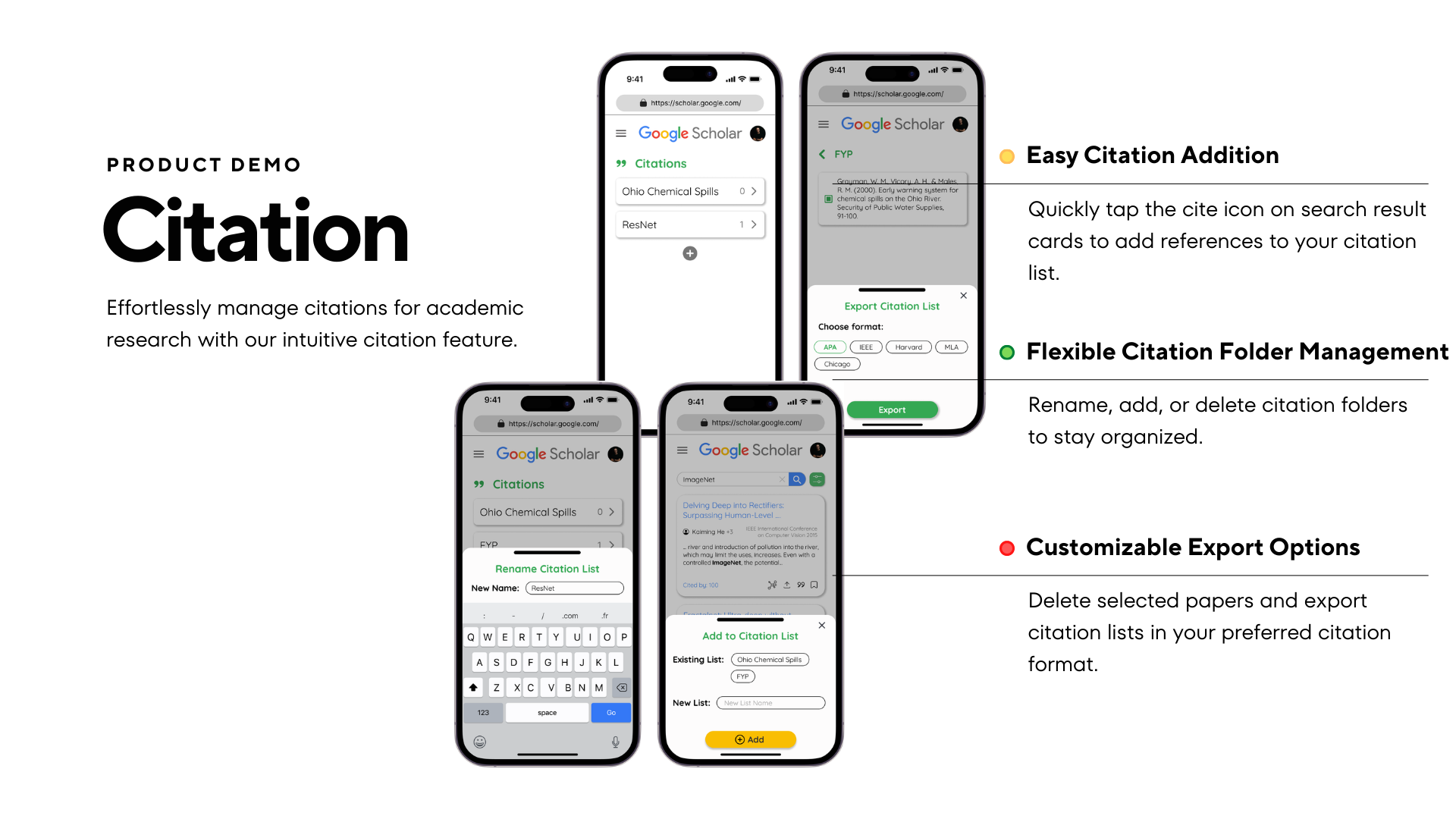
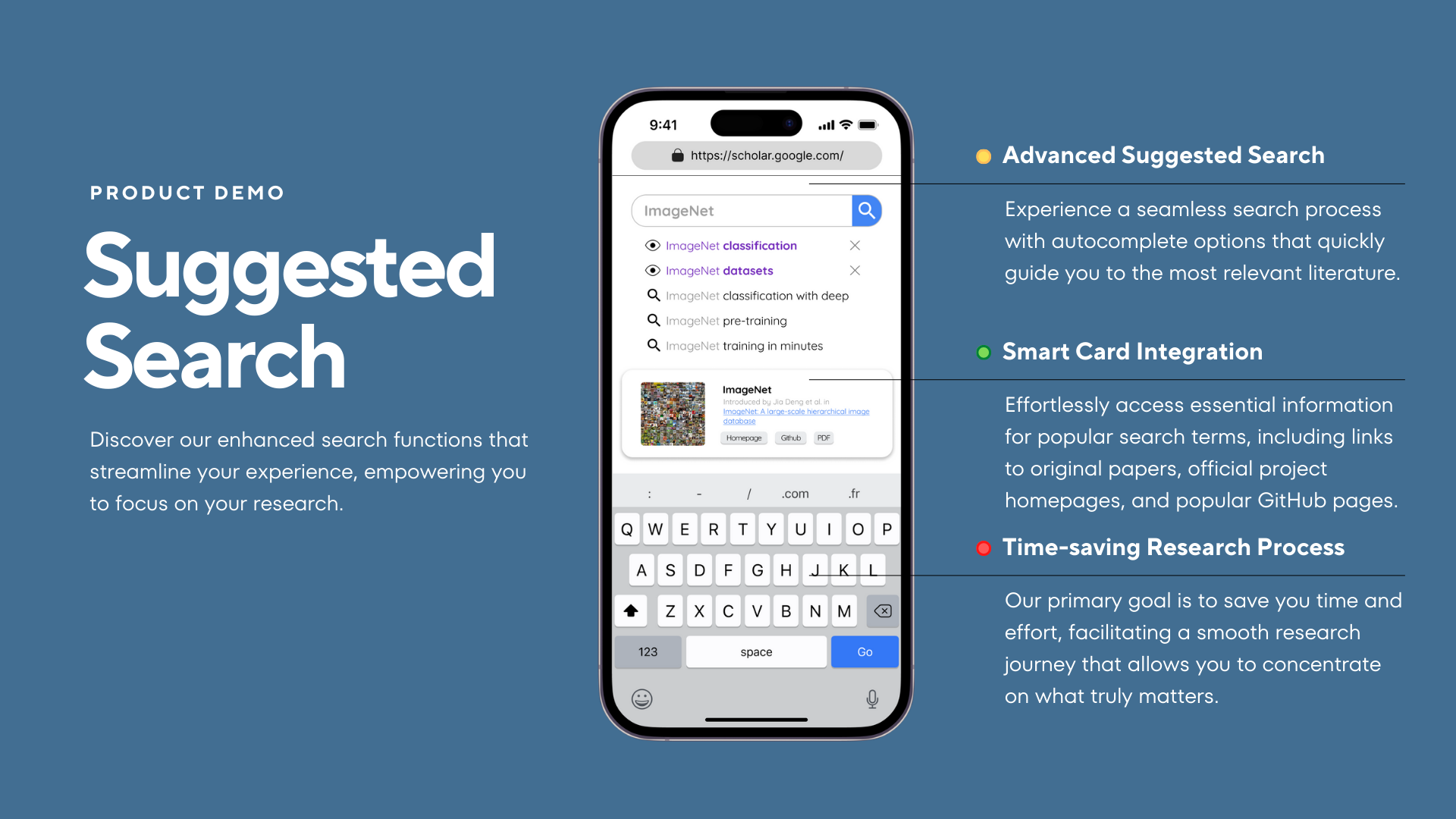
Our finetuned final prototype after usability testings.
SECTION V - REFLECTIONS
My takeaways.
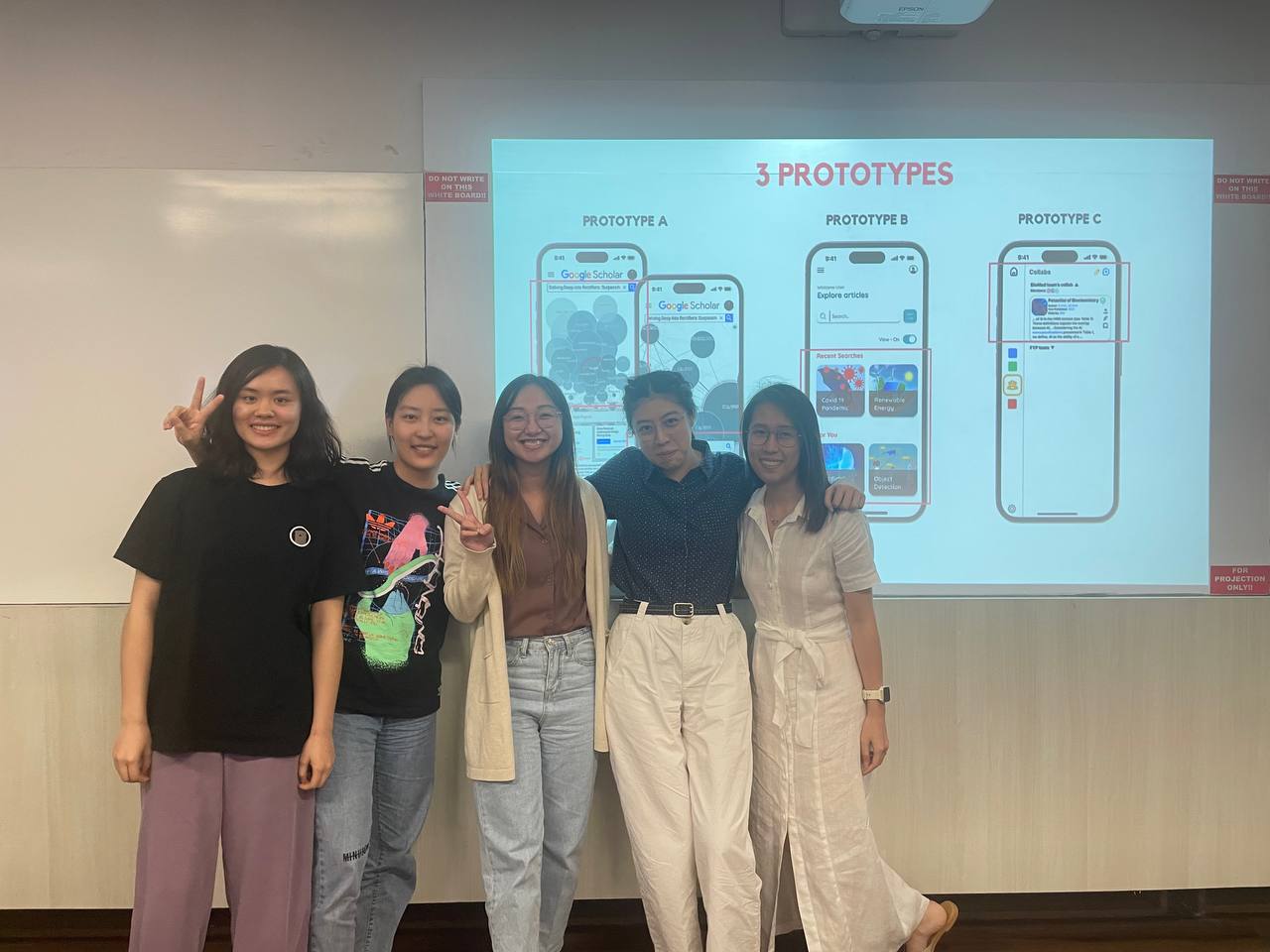
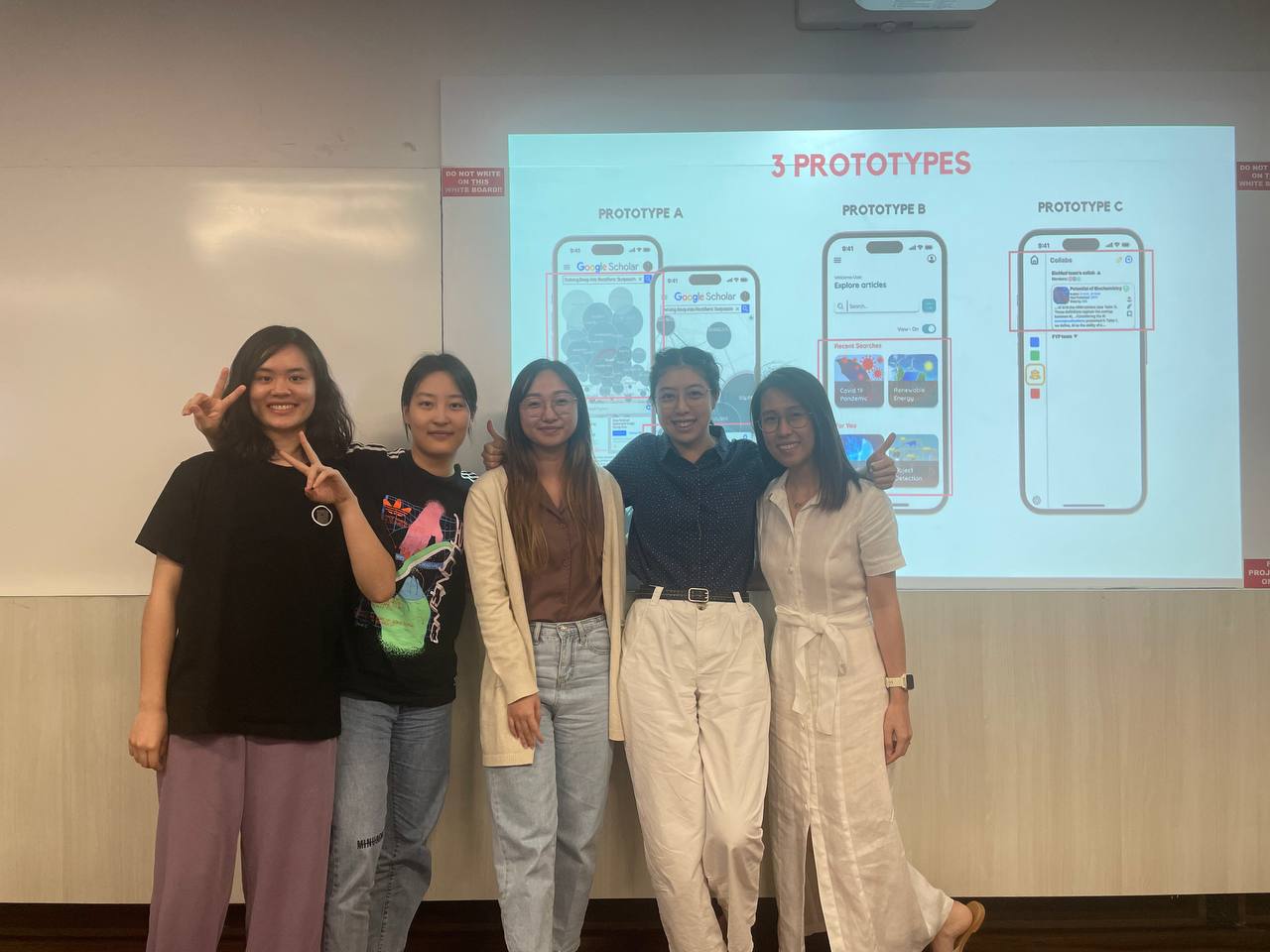
🍉Reflecting on this UI/UX design project for Google Scholar, I have gained a wealth of insights and valuable experience that has expanded my understanding of the design process. Working with Figma as a design tool, I was able to collaborate seamlessly with my team, turning our collective ideas into functional prototypes.
🥭One key learning from this project was the importance of user research and empathy. By employing various research methods and considering real user needs, we were able to identify critical pain points and develop targeted solutions. This user-centric approach allowed us to avoid assumptions and create designs that genuinely resonated with our target audience.
🥑The brainstorming sessions with my team were incredibly enriching, as each member brought unique perspectives and expertise to the table. These diverse ideas culminated in the creation of three distinct prototypes, which we then subjected to usability testing. This crucial step in the process provided valuable feedback, ensuring our designs were not only innovative but also practical and user-friendly.
🍊Another significant takeaway was the value of iteration in the design process. As we refined our prototypes based on user feedback, I realized that continuous improvement is vital for delivering a product that truly meets users' expectations. This iterative approach helped us to address any shortcomings and incorporate enhancements for an optimal user experience.
🫐Collaborating in Figma proved to be an effective way of streamlining our design process. The tool's real-time collaboration capabilities allowed us to work together seamlessly, share feedback, and make adjustments as needed. This was crucial in ensuring that our final design was polished and cohesive.
🍎In conclusion, this project has been an immensely rewarding experience, deepening my appreciation for UI/UX design principles and the power of collaboration. The knowledge and skills acquired during this journey will undoubtedly serve me well in future design endeavors.